All articles
UX1 min read
The checkout path has to work in one hand
Cart, shipping, and pay should be obvious on a small screen - not a desktop layout squeezed down.
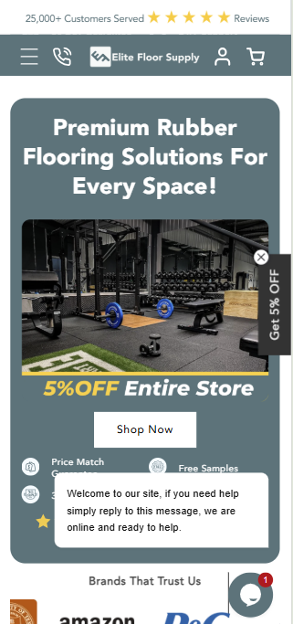
Most Shopify traffic arrives on a phone. Expert101 designs the cart and checkout as a sequence a shopper can finish with a thumb, not a resized desktop page.
What we look at
- Where the cart sits in the header and on the product page.
- Shipping and payment choices that do not hide under another accordion.
- Guest checkout that does not force an account mid-tap.
If the live store feels longer than it should, book a meeting and we will walk the path together.
Want This Applied to Your Store?
Book a call and we'll walk through your theme, checkout and growth path with you.